Process
This page has been included to explain the reasoning behind the design of our website as well as the process of development. Below are three tabs explaining the planning, execution, and publishing of our websites.
- Planning
- Executing
- Publishing
 Our first order of business was to decide on a target audience. This audience includes technical course students, teachers, parents of students, people in the community, and anyone else wanting to know about Polk County High School's TSA, the technical department of PCHS, or accessible web development.
We then divided the content involved with this competition among three sites, and we established what design to use on each site. Similar yet different designs were used for each site, because we wanted the Design Brief, the PCHS TSA website, and the PCHS Technology Department website to be distinguishable from each other.The similarities reside in the basic design of each such as the menus and page layout, but the content remains very different.
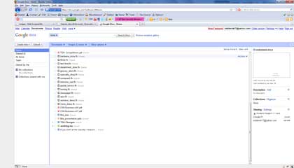
The roles of each member on our team were also decided upon at this time. The high school technical department's website and the high school TSA chapter's website were assigned to one person while the design brief, being the largest of the three sites, was assigned to the remaining two web developers on our team. We had a graphic designer to create the banners and edit any images needed. Next, we created a timeline for our websites. We needed to have certain parts of our project completed at various times. This ensured that we would stay on track and accomplish all of our goals. Our team collaborated using Google Docs, because we are all in different classes. Information and updates among our team were shared using Google Docs, and ideas were communicated through the use of Google Docs.
 Before a computer was touched, blueprints for the design brief were drawn. When drawing the blueprints, the accessibility of this website was taken into consideration. This site had to be accessible to the visually impaired, so the blueprints were made within the confines of accessibility for people who are blind, color-blind, or who have visual acuity problems. To decide on what pages to have and what content to include on each page, we made a plan of what we wanted our site to cover. We decided on which visual impairments to go over (Blindness, Color Blindness, and Visual Acuity Problems), and what parts of accessible web design we wanted to include (Good web design practices, good elements of coding, and tools which could be used by web developers to check their accessibility as well as tools which could be used by the visually impaired to provide enhanced accessibility). We also decided to include the federal regulations of the United States and the industry standards, according to the World Wide Web Consortium, pertaining to accessible web design. Lastly, a resources page was included to show where we obtained pictures/information and which programs would be used in the development of our site. After this was done, we brainstormed on a design for our website. We knew the design brief required accessibility to the visually impaired, so we made the design within those confines.
After the blueprints were drawn and a design decided upon, research was conducted. Knowledge of visual impairment conditions such as blindness, color blindness, and low vision was obtained through the use of websites such as Center for Disease Control, World Health Organization, and several others. Then research had to be done pertaining to good web design practices, good elements of code, and tools available to those with visual impairments. To finish the research, the federal regulations related to web accessibility for the visually impaired were found from Section508, and the industry standards involved with creating a usable website for the visually impaired were obtained from World Wide Web Consortium.
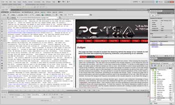
 The template for the design brief was then created from scratch using Artisteer 3 and imported into Adobe Dreamweaver CS5. We created the template according to our blueprints, and we created the rest of the pages of our website from that template. The site includes home, about, blind, color-blind, visual acuity, federal regulations, industry standards, resources, and judges pages. It also includes links to our other sites such as the PCHS TSA and Technology Department websites. We created spry menu bars within most of our pages to include the content without causing a page with excessive length. The content was made using Microsoft Word 2007 and then inserted into the pages of the site. Also, the images in the site were either obtained from iClipart and TSA, taken as a screenshot during development, or made using Microsoft Excel 2007. All of the images were then edited using Adobe Photoshop CS5. JS Lightbox was incorporated to show our screenshots at a larger scale in an easy-to-use way.
 Lastly, testing was done. We tested our websites on many of the latest browsers manually, which showed us excellent compatibility firsthand, but we also used Adobe BrowserLab to test our websites on a PC, Mac, and several mobile devices.
We found that our websites are compatible on Windows with Chrome 7 and Chrome 8, on Windows and Mac with Firefox 2, Firefox 3, Firefox 3.6, and Firefox 4, on Windows with Internet Explorer 7, Internet Explorer 8, and Internet Explorer 9, and on Mac with Safari 3, Safari 4, and Safari 5. After testing, we published each website. They are now all three live on the web for the public to see.