Blindness
- Description
- Design Practices
- Coding
- Tools
 Blindness is a major obstacle when it comes to accessible web design, because blind people simply can not see anything on the screen. This condition affects over 15 million people just in the United States. Although blind people cannot see, most of them can hear.
Using today's technology, people suffering from blindness can hear the internet instead of seeing it using screen readers other tools which allow for either a computer to read out loud or a braille tool to translate what most people can see naturally, providing those with no vision nearly the same web accessibility and usability as those with full vision.
Use Less Graphics – In general, using less graphics causes less load time, but also, it creates less content for people without vision to imagine with just the help of a description.
Check Elements – When you are creating elements of your website, such as tables, make sure the order is logical. By doing this, you will allow the screen reader to make sense when it reads the information off to a blind person.
Make Forms Logically – Many people without vision use the tab key to navigate forms. The order in which the tab key navigates the form should reflect the logical order for the user compiling the form.
Watch Page Length – For any website, pages should not be too long. People get bored too easily, but especially for the blind, you should make pages as short and concise as possible. If you have long pages, punctuate them with headings. This way, the various sections are identified easily.
HTML Validation – You should always validate your code. This will stop screen readers and other alternate browsers from misinterpreting the source code. A Doctype identifies how you validate your code. Always make sure you have the right Doctype for the html page you are designing.

Alt & Title Tags – Using alt and title
tags for images and other elements are very helpful
for the visually impaired since screen readers use the
descriptive text to tell them what they cannot see.
Also, be sure to use fairly long descriptions for complex
images.

Title Links Correctly – Screen readers
often read the links on a page to blind people to give
them an idea of how the page is laid out. So, when you
are putting a link in your content, don't title it "click
here". The link should contain a word or words that
pertain to what the link leads to.

Add Links for Pictures – Many software
programs used by the visually impaired do not read image
maps, so it is important to make text links available
in your content also.

Make Video Descriptions – Some videos
are not described in text or audio. Make sure yours
isn't one of them.

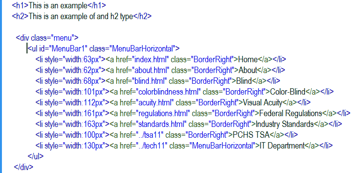
Headings and Menus – Always use 'h'
tags for your headings and unordered list tags for your
menus. This is necessary because of the way screen readers
read web pages.
For Developers
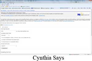
-Cynthia Says- This tool, created for web developers, tests one page of a website at a time to check accessibility according to Section 508 regulations and World Wide Web Consortium standards. It validates one page at a time and is meant for educational purposes. It is one of the top tools used by web developers to ensure accessibility.
-CSS
Analyzer- This tool allows web developers to test the
validity of the CSS used in their web pages against
the World Wide Web Consortium (W3C) validation service.
This tool also provides a color contrast test for fonts
and background colors to ensure the colors are distinguishable
from one another. Lastly, this service checks the specified
units of measurement for relevant fonts to make sure
they are relative and not absolute. This means that
the fonts can be easily adjusted within the browser.
-Image
Analyzer- This tool, made for web developers also, examines
the images on web pages to make sure appropriate values
are used for the alt and longdesc attributes. This ensures
that the images have descriptions, which is a must for
visually impaired accessibility.
-AccessColor- Made for web developers, this tool tests
the color brightness and color contrast between background,
foreground, and text in a web page. It will not only
flag sections of a page with color combinations that
would prove problematic but also provide relevant color
combinations for developers to use within their HTML
and CSS documents.
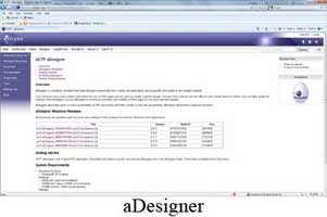
-aDesigner- This tool, also made for web designers,
ensures that the content and applications on web pages
are usable and accessible by the visually impaired.
To do this, it checks the color contrast between foreground
and background objects, the flexibility of font size,
the use of alternate text for images, and the ability
of links on the page to show navigability.
For Visually Impaired
-Web
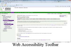
Accessibility Toolbar- Made for both web developers
and the visually impaired users, this toolbar can do
a variety of things. It can change the color and size
of text for users, but it can also validate HTML and
CSS for designers.
-LowBrowse- This tool, created for people with vision
problems, presents text in an easy-to-see way when you
mouse over the text. The tool provides a special reading
frame which includes the text in a single line with
customizable font size, font, color contrast, and letter
spacing without the necessity of zooming in and out.
Also, this service includes a speech output system to
further aid the accessibility for the visually impaired.
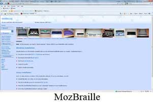
-MozBraille-
This tool is not only a tool, but an extension onto
the Mozilla Firefox browser. It turns the normal Mozilla
Firefox browser into a completely new browser designed
for blind, color-blind, and other visually impaired
users. It includes a braille output, a text-to-speech
output, and a view in order to increase character size.
Still in beta form, this is a great new browser for
those who are visually impaired to access the internet.
