Color Blindness
- Description
- Design Practices
- Coding
- Tools
Color blindness is a major factor in accessibility related to web design, because it involves the inability to distinguish information. This is caused by the visually impaired seeing similar shades of certain colors instead of the contrasting colors which were intended for the website.  Over 10 million people in the United States alone have this condition. There are different kinds of colorblindness and even total colorblindness, which involves having vision on a grayscale.
To the right, there is a picture of several color blindness tests put together. If someone can't see the number in one of the squares, they are most likely color-blind in some way.
There are three major kinds of color blindness:
* Deuteranopia, is an insensitivity to green.
* Protanopia, is an insensitivity to red.
* Tritanopia, is an insensitivity to blue.
Since we know what color blindness is, we are able to create websites which use colors that are distinguishable to almost all people affected by this disability. There are also several tools which can change style sheets to allow for more contrast on a web page, providing those with color blindness close to the same web accessibility and usability as those with full vision.
Contrast is Everything – Contrast is a measure of how well colors can be distinguished from others. When making a website, contrasting colors should always be used, but especially for the color-blind, colors must be chosen that color-blind people are rarely affected by. This way, people with color blindness and normal vision can all tell the difference in the color scheme.
Graphics Must Contrast – All graphics on a website should have contrasting colors, but also make sure that graphics are used which do not contain a lot of red, green and blue together. This will ensure color-blind people can also see the images on a website.
Check Elements – When you are creating elements of your website, such as tables, make sure the order is logical. By doing this, you will allow the screen reader to make sense when it reads the information off to a blind person.
Watch Page Length – For any website, pages should not be too long. People get bored too easily, but especially for the visually impaired, pages should be made as short and concise as possible. If there are long pages, punctuate them with headings. This way, the various sections are identified easily.
HTML Validation – You should always validate your code. This will stop screen readers and other alternate browsers from misinterpreting the source code. A Doctype identifies how you validate your code. Always make sure you have the right Doctype for the html page you are designing.

Alt & Title Tags – Using alt and title
tags for images and other elements are very helpful
for the visually impaired since screen readers use the
descriptive text to tell them what they cannot see.
Also, be sure to use fairly long descriptions for complex
images.

Color Links Correctly –Many people forget the background and font colors included for links when they have not been used, are hovered over, or have been used. Always pay attention to these colors, and again, check the contrast.

Add Links for Pictures – Many software
programs used by the visually impaired do not read image
maps, so it is important to make text links available
in your content also.

For Developers
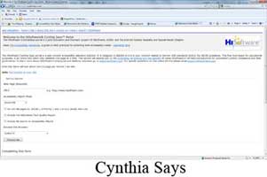
-Cynthia Says- This tool, created for web developers, tests one page of a website at a time to check accessibility according to Section 508 regulations and World Wide Web Consortium standards. It validates one page at a time and is meant for educational purposes. It is one of the top tools used by web developers to ensure accessibility.
-Web Accessibility Toolbar- Made for both web developers and the visually impaired users, this toolbar can do a variety of things. It can change the color and size of text for users, but it can also validate HTML and CSS for designers.
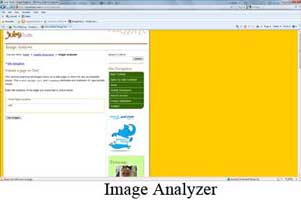
-Image Analyzer- This tool, made for web developers also, examines the images on web pages to make sure appropriate values are used for the alt and longdesc attributes. This ensures that the images have descriptions, which is a must for visually impaired accessibility.
-AccessColor- Made for web developers, this tool tests the color brightness and color contrast between background, foreground, and text in a web page. It will not only flag sections of a page with color combinations that would prove problematics but also provide relevant color combinations for developers to use within their HTML and CSS documents.
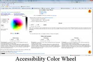
-Accessibility Color Wheel- Also made for web developers, this tool aids in the design process by showing developers what different text color and background color choices would look like. It also displays how these choices would appear to various types of color blindness. This is one of the most useful tools when creating a site accessible to the color-blind. It used World Wide Web Consortium (W3C) algorithms to show if color pairs are considered “good” from the accessibility point of view.
For Visually Impaired
-Web Accessibility Toolbar- Made for both web developers and the visually impaired users, this toolbar can do a variety of things. It can change the color and size of text for users, but it can also validate HTML and CSS for designers.
-LowBrowse- This tool, created for people with vision problems, presents text in an easy-to-see way when you mouse over the text. The tool provides a special reading frame which includes the text in a single line with customizable font size, font, color contrast, and letter spacing without the necessity of zooming in and out. Also, this service includes a speech output system to further aid the accessibility for the visually impaired.
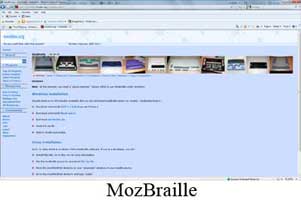
-MozBraille- This tool is not only a tool, but an extension onto the Mozilla Firefox browser. It turns the normal Mozilla Firefox browser into a completely new browser designed for blind, color-blind, and other visually impaired users. It includes a Braille output, a text-to-speech output, and a view in order to increase character size. Still in beta form, this is a great new browser for those who are visually impaired to access the internet.


